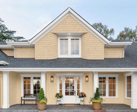
Could a color of paint make you feel better? Does it make your home better? People who work in building, real estate, and interior design all say yes! The August 2025 Trend Tracker from review and resource site Yelp shows that searches for "exterior home painting" have grown by 245%, which is the most in the last five years. Right now, butter yellow is the "it" color. In front of homes, maybe on a street near you, this is how it looks.
Reasons for Butter Yellow?
"People want colors for their homes that make them feel more welcome than ever!" "A buttery yellow is the best way to achieve that goal because it is warm and creamy," says color expert Amy Wax. If there was a single color that could describe a feeling or vibe, it would be yellow, which means happiness! She says it's a very natural color that goes well with nature without taking over.
Wax thinks butter yellow is part of a bigger trend: "I think sweet colors are popular for the outside, colors that are soothing, charming, and really inviting!" When people ask for outdoor colors, soft greens, blues that aren't too strong, and yellows that aren't too bright are definitely what people want. When I make a color scheme for a home, the colors have to fit the style and tastes of the people who live there. Having said that, I'm seeing more calls for color and people moving away from the whites, grays, and neutrals of the past few seasons.
Tara Lewis, a trend expert for Yelp, agrees: "Right now, there's a bigger shift happening. People are moving away from all the grays and beige and toward maximalist and dopamine decor." It looks great with everything because butter yellow is a warm neutral color that still feels bright and fun.
A lot of the professionals this story talked to seemed to agree on how happy butter yellow is. The founder of the online home repair store The Trade Table, Forrest Webber, says, "After years of gray being the most popular color for exteriors, people are now looking for warmer, more uplifting colors." Butter yellow is a good color because it has the happiness of a bright color and the polished softness of a pastel. It gives a room a new look that still fits in with the rest of the neighborhood. Just like his coworkers, he thinks it looks great in kitchens, breakfast nooks, and laundry rooms, which are "places where homeowners want a light, uplifting feel." (The main rooms in my house are butter yellow.)
Emily Kantz, color marketing manager at Sherwin-Williams, says this about butter yellow: "It goes with a lot of different architectural styles, from coastal and colonial to mid-century modern, craftsman, and farmhouse." People all over the country love it because of that and the warm color.
Trendy Shops
Kate Hendrickson, an associate realtor with Better Homes and Gardens Real Estate Haven Properties in San Luis Obispo, says, "Butter yellow is having a moment, and it doesn't surprise me at all." Butter yellow is being used on cute Craftsman-style homes and coastal cottages in my Central California area. People are buying it because it has a happy, sunny vibe that Gen Z and Millennial buyers love because they want warmth, character, and charm.
Alli Pepperling, a Compass broker in the Raleigh area, says, "Butter yellow is gaining a lot of traction in our Triangle market, and I'm seeing it have a real effect on buyer interest and sales velocity." For her, it seems like it will last. "Butter yellow looks great on homes that have Southern charm and personality," she says.
Gary Baxter, a licensed general builder, agrees. "Butter yellow is starting to show up in our Metro Atlanta and North Georgia market. This is especially true for people who want to update older homes or build new homes in neighborhoods that value a warm, welcoming front porch." There are more calls now than there were a couple of years ago, but it's not yet taking over the market. He says that the prices of both paint and panels are going up.
A little further down the coast, in Savannah, Casey Ricks of Baywater Custom Builders is seeing more butter yellow, but it hasn't taken over yet. "It's not a color we see very often on the outside of homes, but when a client picks it, it really stands out and makes a nice, welcoming first impression."
Kathie Chrisicos, an interior designer and real estate agent at William Raveis in Back Bay, Boston, says that butter yellow is a favorite "quiet soft shade" for the outside of homes in New England, especially "in our seaside cities and towns." She thinks it adds to the charm of small houses with a historic look. "In our established neighborhoods," she adds, "I have seen butter yellow make a classic New England Colonial stand out from its neighbors."
Opportunity in a niche
Mark Lumpkin, founder of STR Cribs, helps owners of short-term rentals across the country make their homes more appealing to travelers using VRBO and Airbnb. This gives him a unique view of color and design trends in a wide range of markets. He sees a shift toward butter yellow, especially in coastal and cottage homes, but he can't put his finger on a single reason. Along with ideas about how sweet, nostalgic, and "happy" it is, Lumpkin brings up a tactical point that could be very important: "We have found that this color looks good in photos taken during the "golden hour" of natural light in rooms that are rented out for short periods of time," he says.
Watch out!
Wax warns that not all yellows are the same. "Yellow that is smooth and light can make you feel warm and welcome." When the yellow is too strong, it can make people feel tense and irritated. It is very important to pick the right yellow for your house, whether it's inside or outside!
Even the real estate site Zillow agrees. It says in its Summer 2025 paint color report, "Buyers would pay almost $4,000 less for a home with a daisy yellow kitchen ($3,915 less) or living room ($3,891 less”). Butter lovers, be careful!
Not for everyone
People don't always choose butter yellow, and the reason for this is that building materials and styles vary from place to place. Christy Walker, realtor and owner of REMAX Signature in Phoenix, says that natural and neutral colors are most popular in her market because of stucco and tile roofs. "Also, HOAs have a lot of control over what colors can be used. And while trends come and go, they don't usually change their rules to allow colors that might not go with the overall look they've created with desert colors," she says.
Cindy Chen, a Compass realtor in New York City, is seeing more butter yellow used inside homes. When it comes to the outside, Chen thinks it looks great on cottage and bungalow-style houses. There aren't as many of these in the city market as there are in other markets.
In conclusion
"Soothing colors are the ones that make people feel the most at ease," Wax says, naming butter yellow, soft blues, greens, and salmon pinks. "The colors that are easiest on the eyes and most pleasant to live with are the ones that calm you down at the end of the day!" And these days and nights, who wouldn't want something soothing?