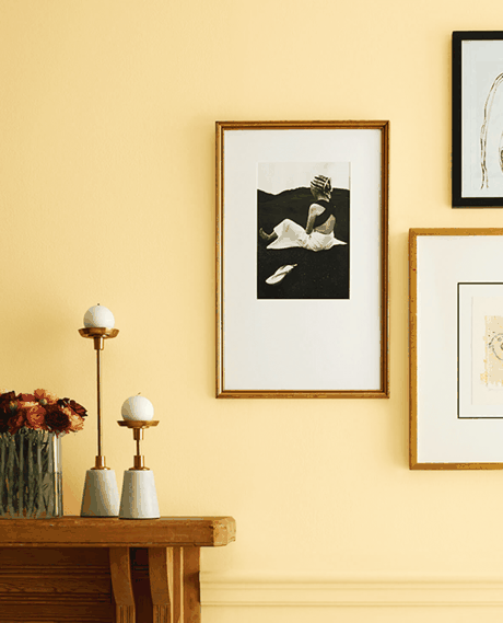
If the last decade was defined by sterile "millennial grey" and stark, clinical whites, 2026 is officially the antidote.
This year, interior palettes have taken a dramatic turn toward rich warmth, tactile earthiness, and moody, intentional color. Homes are shifting from feeling like minimalist galleries to cocoon-like sanctuaries designed for comfort and personality.
Whether you are planning a full-home renovation or just hunting for the perfect paint swatch for a weekend project, these are the standout interior color trends taking over in 2026.
1. Deep Chocolate Brown: The New Anchor Neutral
Forget greige—rich, velvety brown is unequivocally the dominant neutral of 2026. Moving far past the flat mud-browns of the early 2000s, today's cocoa, espresso, and dark walnut shades feel grounding and deeply luxurious.
-
Where to use it: Wood-paneled studies, rich leather accent chairs, and full-wall paint treatments paired with warm cream trim.
-
Pairs best with: Unlacquered brass, warm alabaster, and soft linen textiles.
2. Burnt Amber & Warm Caramel
A continuation of the shift toward warmth, amber and burnt caramel sit at the intersection of golden mustard, terracotta, and soft brown. Nostalgic yet contemporary, these hues add an unctuous, sun-baked quality to any room.
-
Where to use it: Leather upholstery, velvet drapes, or warmth-infused bathroom tiles.
-
Why it works: It instantly wakes up cool wood finishes or stone without feeling overly bright or loud.
3. Oxblood, Burgundy, and Merlot
Saturated, moody reds have officially secured their place in high-end design. Far from primary red, these earth-bound, wine-inspired tones bring drama and depth to intimate spaces.
Design Tip: Try burgundy on kitchen cabinetry or in a powder room paired with dark soapstone or marble counters for a quiet luxury look.
4. Transformative Teal & Deep Greens
Earthy moss and muted olive continue to serve as nature's neutral, but complex jewel-toned greens and teals are leading the charge for dramatic spaces. Driven by trend forecasts like WGSN's "Transformative Teal," these shades bridge the gap between soothing green and serene blue.
| Shade | Mood | Ideal Space |
| Olive & Moss | Calming, organic, understated | Living rooms, kitchens, bedrooms |
| Transformative Teal | Enveloping, expressive, luxurious | Formal dining rooms, libraries, accent cabinetry |
5. Butter Yellow & Luminous Warm Whites
Crisp, blue-toned whites have given way to creamy, soft, and luminous whites—epitomized by picks like Pantone’s Cloud Dancer. Beside these evolved whites sits butter yellow: a soft, optimistic shade that adds subtle warmth without overwhelming a room.
-
The vibe: Nostalgic, gentle, and airy.
-
Where to use it: Breakfast nooks, guest bedrooms, or trim work against a warm cream backdrop.
How to Apply These Trends in 2026
-
Embrace Color Drenching: Instead of painting a single accent wall, paint the walls, baseboards, door frames, and even the ceiling in a single saturated tone (like plum, navy, or charcoal) to create a seamless, cozy atmosphere.
-
Focus on Material-First Palettes: Let natural stone, rich woods, and unrefined metals guide your color choices—earthy paints naturally complement raw materials.
-
Layer Tone-on-Tone: Combine varying depths of the same color family (e.g., camel, caramel, and espresso) rather than stark contrasting shades for a more sophisticated, enduring look.